Basic Supplies & Materials For Watercolor Painting
BASIC SUPPLIES AND MATERIALS DOWNLOAD LIST
Use the info and videos to help you select the materials you’ll need to get started painting in watercolor. Although it seems minimalist, this set of supplies will serve you well for a long time. The info videos are short but will help you understand important pieces of info that you might encounter when browsing for art supplies.
The info download link below includes a checklist of materials to use when shopping online or in your local art supply store.
KEEP IT SIMPLE
The best overall advice when it comes to choosing and buying watercolor paint, paper, brushes and other supplies is to keep it simple – especially if you are new to watercolor painting.
Another valuable piece of advice is to invest in professional quality materials. They will help you get a handle on this tricky medium better than inexpensive ones. Consider the expense involved as an investment in yourself and one that will actually save you time and give better results in the long run.
Keep It Simple!. Especially if you are just starting out. Working with a limited number of colors from the start will help you develop a sensitive eye for color and lead to exceptional color mixing skills.
The best advice is to start with professonal grade paint. The way it looks and works is more than worth the cost.
CIGN Codes: Every manufacturer attaches a name to the colors they sell. These names are descriptive but they are not necessarily comparative. The only way to know exactly what color you are getting is by knowing the CIGN Code.
The Basic Materials List download has more info on CIGN Codes.
Every tube of watercolor paint contains a mixture of finely ground color pigments and a binder.
The color pigments are what creates the actual color. Each pigment is classified and indexed by the pigment and dye industry.
It is important to know what pigments are used to create the colors you paint with. The name on the outside of the tube is usually a common, familiar name but the color inside the tube may be very different from brand to brand. The underlying pigment will tell you more about the color than the name on the tube.
This short tutorial discusses pigment codes, how to find pigment info for your paint and to know when the color will vary by brand.
You’ll need something to hold and mix your colors. Any large – at least 10” x 12”- sturdy, white plastic palette with a cover will do.
Make sure it has large wells for the paint and a large mixing area in the middle. There are many manufacturers that produce good, low-cost plastic palettes that will perform well for many years.
A handful quality synthetic or synthetic/natural blend brushes are really all that are needed to do the trick. The most important characteristics are ability to hold lots of paint and water, and to have a responsive “touch”.
Brushes can be made of either synthetic materials or natural hair. Natural hair brushes are generally quite expensive. They are great, but you can get along just fine with a set of quality nylon brushes. The bristles of nylon brushes can be either white or golden brown in color. Modern synthetics are also quite soft, mimicking the feel and responsiveness of natural-hair brushes.
Do not skimp on watercolor paper – there are great differences in quality and working characteristics between professional grade and everything else.
The recommended paper for everyone, especially Beginners is Arches 140lb Cold Press paper. It is durable and will help you manage those very fluid washes that bring out the best in watercolor.
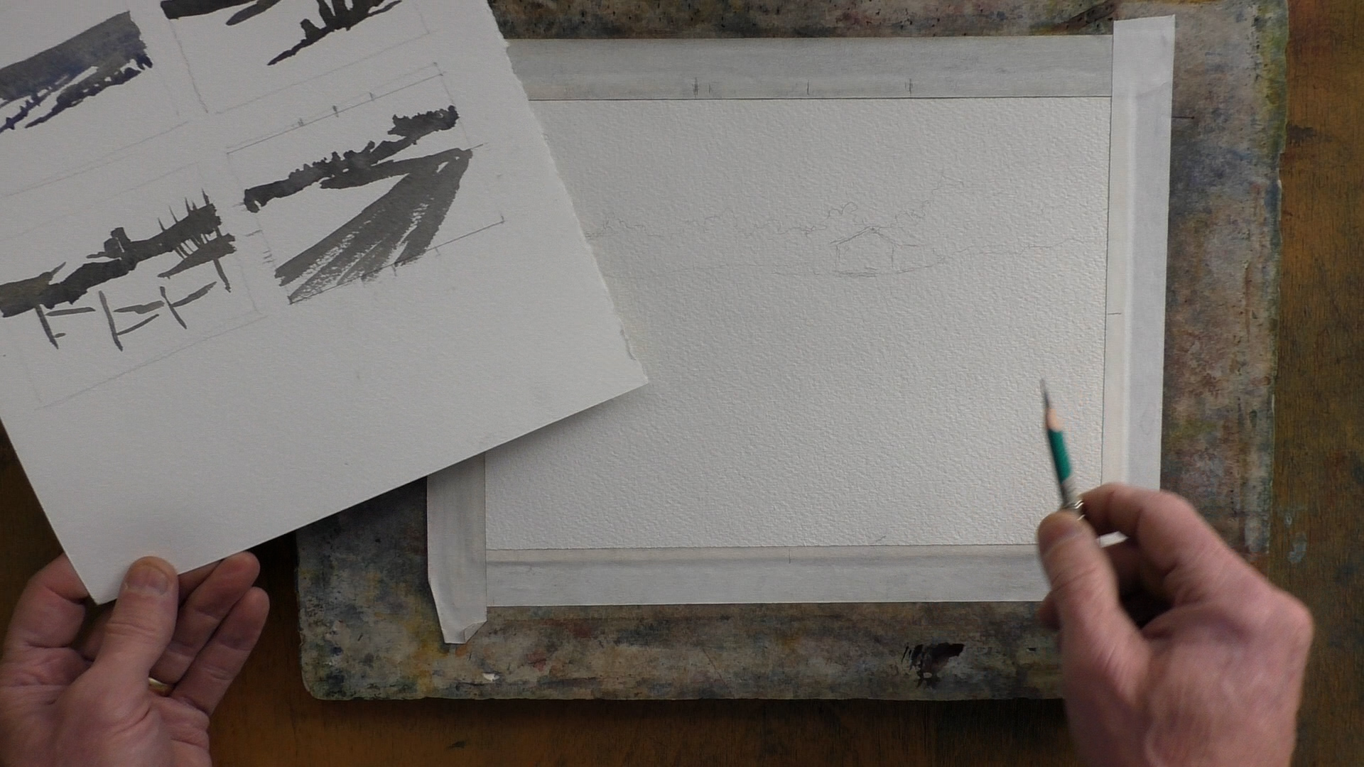
Watercolor paper needs to be supported while painting. A recommended product is known as “Gatorboard”. It is thicker version of foam-core board made from plastic materials to prevent warping. It is light, sturdy and durable. Paper can be taped, clamped or stretched to Gatorboard.
If you have a piece of scrap masonite, plywood or luan laying around, you can use that. Just remember that any wooden board needs to be sealed with several coats of varnish to prevent warping.
You’ll also need some rags for blotting and cleanup. Paper towels are popular and absorbent but old T-shirts, sheets or bath towels cut into rectangles is the more environmentally friendly way to go!
You can use one or two water containers With two containers, it is easier to keep one relatively clean so as not to sully the colors on your palette. Don’t buy anything specially for this, just re-use old plastic containers.
Where To Go From Here
Getting Set Up To Paint
Seven short tutorials with tips to help you get set up to paint.
Preparing your palette and materials, stretching paper, transferring the drawing and more.

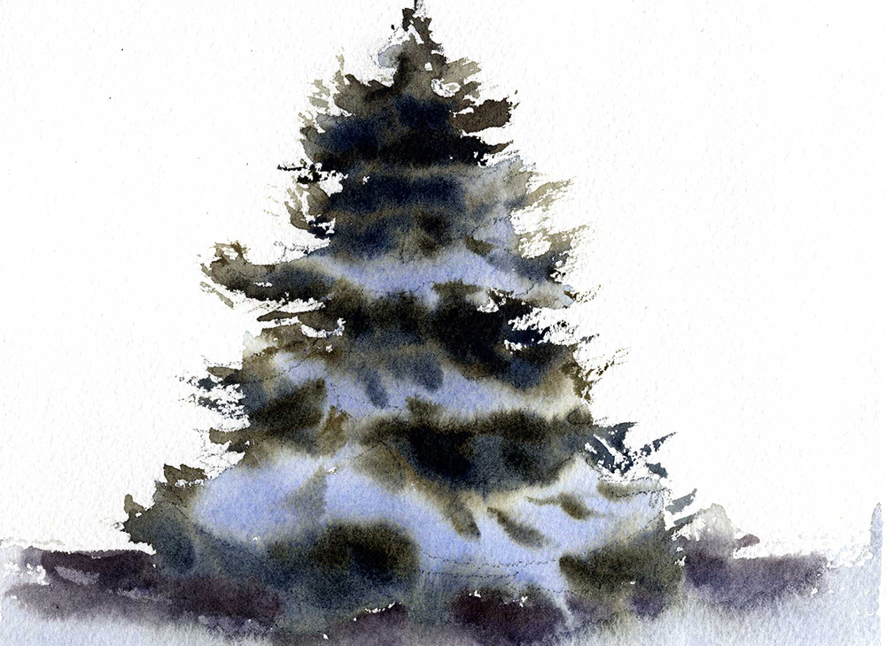
Watercolor Painting Basic Techniques
GREAT FOR BEGINNERS!
Six lessons that demo the four basic watercolor painting techniques. Also learn the common problems, how to avoid them and how to fix them.
Easy Watercolor Painting Lessons
These are short, easy lessons of simple subjects and scenes.
They’ll get you started and help develop skill with basic watercolor painting techniques.