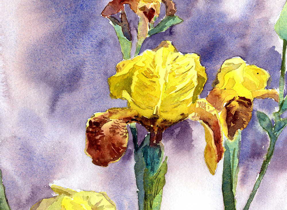
Painting Purple Irises In A Vignette Composition
The Vignette Has Some Specific Rules That Strenghten The Compsition
The painting in this lesson is a “vignette” – which is explained in the lesson. The composition is built around the use and contrast of positive and negative space.
It’s an easy lesson because there’s less paint and more paper. We work through it step-by-step too!

WHAT YOU’LL LEARN
Learn about Positive and Negative Space
Learn the specific ideas for painting a ‘Vignette’ composition
WHAT YOU’LL NEED
- Brushes – Medium Round, Small Round, and Cotman #3 Rigger .
- Colors – Winsor Newton Perm. Alizarin Crimson, , Winsor Newton French Ultramarine Blue , Cobalt Blue, Daniel Smith Lemon Yellow, DaVinci Cadmium Yellow Medium
- Watercolor paper – preferably Arches 140lb Cold Press cut to about 7″ x 11″ or so
DOWNLOADS :
Paint It!
All paintings are visual illusions created by dividing up finite two-dimensional space – hopefully in a dynamic and eye-catching way. We often speak of placing shapes on our picture plane.
Positive shapes usually we represent the objects that make up the subject of our work. The remaining shapes – those we find in between and around our positive shapes – are often “negative” shapes. It is possible to create dynamism and visual interest by contrasting and interweaving positive and negative shapes for visual effect.
This lesson is about creating a dynamic vignette composition with conscious placement of positive and negative shapes.